Mobile device usage has been in vogue with the release of different smartphones from different leading brands. Mobile phones have become a part and parcel of our life. This 360-degree shift of people towards using the web is not at all surprising. As a result, there is a change in the mind of website owners. It creates urgency in their mind to make their websites mobile-friendly. This is done to create a good vibe among the visitors visiting your website frequently.
Upon landing on your website, if your mobile visitors don’t have a good experience, it will simply drive away the traffic.Therefore, making your website mobile-friendly is inevitable to cope up with the increasing use of smartphones and handsets. But there is a huge gap between knowing something you have to do and knowing how to proceed with the same. Therefore, this informative blog will bring you to the limelight of how to make a website mobile-friendly.
How To Make A Website Mobile-Friendly: 10 Easy Steps
Here are some of the simple steps that you can follow to make your website mobile-friendly.
1. Make your Website Mobile-Responsive
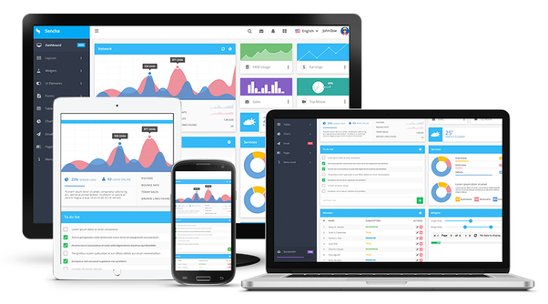
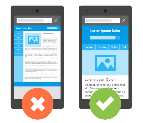
A proper responsive website contains all the contents and information that you find while accessing that site from some other device. But the main difference is the display as well as arrangement are based on the screen size. Moreover, you are not setting the limit for the information. The users will access the same information just like the other visitors. But with the mobile responsive features, they can open the same web page or content anywhere. Also, it is very much beneficial for SEO purpose. Although making mobile-responsive features is not a cup of tea for the beginners. If you are starting fresh off the boat, you need to seek help from an expert. Otherwise, you may search for a website builder containing mobile-friendly templates. Here is one of them
Provide User-Friendly Information for Easy Access
People browsing the web using their mobile device won’t mind taking some time to go through the content with the same speed they do on a computer. However, mobile-savvy users want the information quickly and easily. Therefore, try to explore the facts and findings the mobile users search for while moving to your website. Therefore, try to put something that is very much easy and obvious to get through while browsing the mobile homepage. Moreover, take into account the common FAQs people look for when they are heading towards your website. It is not always easy to provide all the information at the forefront of your homepage. But you should make it easy so that your potential users can navigate comfortably.
Don’t Use Flash
Use of Flash is not preferable since it is not at all SEO-friendly. It sometimes slows the loading time of the page and also doesn’t support all the browsers and devices. Therefore, if you are making a website that is dependent on Flash animations, you have the chance of losing your reliable mobile users. To overcome this hurdle, just scrap the technology from your website and make a strong web design that is compatible.
Add Viewport Meta Tag
This Viewport Meta Tag is an important means to monitor your website that appears on your mobile phone.You have to perform some offbeat scrolling from one side to another to read every line and view several sides of the page if the page opens with the same width just as it opens in your desktop.Therefore, this Viewport Meta Tag feature will inform the browser to fit the width of the web page according to the screen size of the user’s mobile device. Incorporating this feature to your HTML is very easy. Just you need to paste it into the HTML of each page
<meta name=”viewpoint” content=”width=device=width, initial scale=1”>
Turn the Autocorrect Option Off for Forms
Autocorrect sometimes makes the user’s communication with your website inconvenient. If your website contains forms asking for names or address or any other information, a simple way to make that information accessible for your mobile visitors is by turning off for each form field. Else, your phone will make an attempt to change the names with the most used words and can sedate the process of filling the form.
Therefore, in the input field, always include autocorrect=off in the HTML
Make the Button Size Larger
It is much easier to press a button with the same size as the mouse. However, when you are trying to click using fingers on your handset screen, small buttons are not viable. And that is quite irritating when there are numerous small buttons close to one another. Pressing one button while clicking on another can cause great inconvenience to the users.
Hence, the best solution to this issue is to use larger buttons. Whenever you add a button to your website, find some time to test as many mobile devices as possible among your users and employees. Do ensure that choosing every button is easy on every device and if it’s not that, update it to the latest version.
Large Font Size
If you are reading content on a small screen, it will create many difficulties if the font is too small. Therefore, it is good to use a font size of 14px on your web pages. But you can proceed and check how it appears if the size is bigger.
Therefore, adhering to the standard fonts is the best practice.
Compress Images as well as CSS
When talking about the loading time of your site, you always try to enhance the site speed. This is one of the important factors governing mobile responsiveness. The best method of making your website mobile-friendly is to squeeze anything that occupies a large space and reduces the time. This contains images of higher resolution and CSS. Once you squeeze them, you can make the loading time faster without hampering the user experience.
Makes an Easy Gateway to Shift into Desktop Mode
There are some mobile visitors who always want to view the desktop version of the website. Therefore, always ensure that you provide tramadol cheap online them with a platform to use it based on their preference.
Perform Mobile Testing
The ultimate option to check whether your users are getting good vibes or not is to do mobile testing on a regular basis. Try to drag the website frequently on your mobile device and tablet and spare some time browsing it to check if it is difficult to view or not. Inform your employees to perform the same thing and hence, hire users to conduct testing as well.
How To Make A WordPress Website Mobile-Friendly?
Mobile-friendly websites are now among the latest trends. Irrespective of the common errors, it can still be considered a little hectic job to build an attractive responsive web model. Therefore, this short guide will walk you through why it is important to have a mobile-friendly website and how to create it on WordPress.
Use Responsive WordPress Themes
If you are one with a recent installation of a WordPress theme, then there is a good chance that you are doing good in this platform. However, if you are using the theme for some time, then it will take a while to update. You just need to follow some steps. Firstly, you need to double-check your WordPress versions as well as current theme. If there are updates pending, install those immediately. Some of the updates may be equipped with mobile-responsive elements and will be enough to handle the problems. For example, the recent WordPress 4.4 version contains some exclusive functional features to create responsive images.
If the trick of updating the software doesn’t work, search for a new theme. Otherwise, you can create a theme on your own as well.
Top Mobile-Responsive WordPress Themes
Nowadays there is a huge amount of WordPress themes which are mobile-friendly. Before buying a theme, please ensure that it is put up well on all screen sizes. After that, do proper testing on the demo site. Next, you need to scale the browser window. Then, go through any review to get the real-time experience from the users. Even though it might be ideal for your website, there are several WordPress themes available that you can get another one easily which will fulfill your requirements.
Build Your Own Responsive WordPress Themes
If you are following the DIY path to develop a mobile-friendly website, be sure to begin with it from scratch. Otherwise, you can use a child theme. You can never make momentary changes on your live website. There are some free tools available that will permit you to test your current heart’s content by not breaking the website.
Responsive Plugins
Plugins help in adding more functionality to your WordPress site. Therefore, they don’t add anything in the front end. Sometimes, they incorporate certain physical elements to your website making it scalable as per your screen size. Otherwise, it may disable that option available on the small screen size. Similar to themes, always go through the features of the plugin and read the reviews before buying. Your site will be in good shape for showcasing the features on small screens if it is equipped with responsive themes as well as plugins.
Avoid Using Pop-Ups on Handsets
In order to make your WordPress site mobile-responsive and adhering to the best practices, don’t use pop-ups in your mobile designs. This is owing to the fact that Google had started penalizing people who put up unwanted sites, that governs the content of a webpage. This contains several pop-ups as well as opt-ins that a user should dismiss before ingressing into the webpage’s content. How will you proceed with this totally depends on the service powering the plugins. However, the majority of the service providers have the option to disable the unwanted add-ons or plugins on mobile devices.
Opting Responsive Media Strategies
It doesn’t matter whether you are working with an ecommerce website, a portfolio site or a daily blog. To make you WordPress website mobile-friendly, you need to incorporate responsive media strategies. The image placed on the background of your homepage might appear attractive on your desktop site. However, if it is not scaled properly, there might be a loss in the context that can hamper the viewing experience. Therefore, you need to consider the size of the media file you have included on your website. This will enhance the mobile experience as well as desktop loading time. Therefore, in order to streamline your website, use the smallest size to maintain the quality.
Brilliant Web Design Tips to Make Your Site Mobile-Friendly
There are some excellent ways to optimize your website. Have a look:
-
Use of Media Queries
Media queries will help you to inform a device about the size, then it directs to put up things obeying a set of CSS. It is an essential part of a robust mobile-friendly website. Therefore, please ensure that the system has the proper configuration for all the available devices.
-
Don’t turn off the Submit Button
There are many mobile devices available but all of them are not equally credible. This can be a headache for the users who just press the Submit button with the intent of dropping the connection and view the button getting disabled automatically. Making an attempt to minimize this is a good thing but realities suggest not to remove it in this manner.
-
Use Responsive Themes in CMS
Responsive themes make it easy for users to provide a top quality display. This is one of the important factors that most of the companies neglect while making the device mobile-friendly. This is because the users’ experience is important rather than coding it in a simple manner. Therefore, Responsive themes go hand in hand with the casual sites which do not require any customization.
To Sum It Up……
We hope this informative blog will give you in-depth knowledge about mobile-friendly websites. Also, you will get a brief knowledge about how to make your WordPress website mobile-friendly. We are sure that you will not face any difficulties in the future while creating mobile-responsive websites if you follow this blog.